.svg)
Why Tracking Jobs and Services in Real Time Is the Key to a More Profitable Auto Shop
Being busy isn't the same as being profitable. Here's how capturing job and service data in real time — and viewing it on a dashboard — shows you which services perform, where the gaps are, and how to run a more profitable auto shop.

.png)
Helping auto shops work smarter and grow.

Ask most auto shop owners how business is going, and you'll hear some version of "busy" or "slow." Ask them which services made them the most money last quarter, or which type of job is quietly losing them money, and the answer is often a shrug. Not because they don't care, but because the data to answer it was never captured in a way they could actually use.
The most profitable shops run differently. Instead of managing by gut feeling, they track their numbers day to day and let the data tell them where the business is really making money. The good news is that your shop is already generating all of that data every single day — in every job you open, every service you perform, and every invoice you send. The only question is whether you're capturing it or letting it evaporate.
Being busy isn't the same as being profitable
Here's the trap almost every shop falls into: mistaking activity for profit. Your bays are full, your techs are moving, the day feels productive — so business must be good. But volume and profit aren't the same thing. You can do more work for the same money, or even less, and never notice because the shop "felt busy."
Without data, the leaks stay hidden. Maybe one category of service is eating up hours for thin margins. Maybe a job type you assume is a moneymaker is actually your worst performer once you account for the time it takes. When you're running on intuition, you only see the consequences — tight cash flow, stress, long days — not the causes. Tracking the right numbers is how you stop guessing and start seeing exactly where the profit is gained and lost.
Start by capturing data on every job as it happens
Useful reporting starts at the source: the job itself. When every job is logged in real time — what service was performed, which technician handled it, how long it took, what it brought in — you build a clean record of your business as it actually operates, not a rough reconstruction pieced together at month-end.
This is where real-time job tracking matters. Instead of updating a spreadsheet at the end of the week (if it happens at all), each job's status and details are captured as work moves through the shop. The payoff is twofold: you get an accurate live picture of what's happening right now, and you accumulate clean historical data you can actually trust when you look back. Manual entry is slow and error-prone; capturing data at the moment the work happens keeps it honest.
Track the types of services you perform — not just the total
A single revenue number tells you almost nothing about why you made that money. The insight lives one level down: in the breakdown by service type. When you categorize the work — diagnostics, repairs, detailing, installations, whatever your shop does — patterns emerge that a lump-sum total completely hides.
That breakdown is what lets you answer the questions that actually drive decisions. Which services are most profitable, not just most frequent? Which are growing month over month, and which are fading? Where are the gaps — services you could be offering more of, or ones that aren't worth the bay time? You can't make any of these calls from a single figure at the bottom of a page. You need the data organized by the categories that matter to your business.
The real value shows up at month-end and quarter-end
Day-to-day data capture is the foundation, but the strategic payoff arrives when you step back and look at the trends. At the end of a month or a quarter, clean job-level data lets you compare periods and see the real story: which services carried the business, which underperformed, whether your average job value is rising or slipping, and how this quarter stacks up against the last.
This is the difference between analysis and guesswork. A shop owner reviewing a real quarterly breakdown can make concrete decisions — lean into the profitable service lines, fix or drop the weak ones, adjust pricing where margins are thin, and plan staffing around what the shop actually does most. Those decisions compound. Small, data-informed corrections every quarter add up to a meaningfully more profitable shop over a year.
Why a dashboard beats a spreadsheet
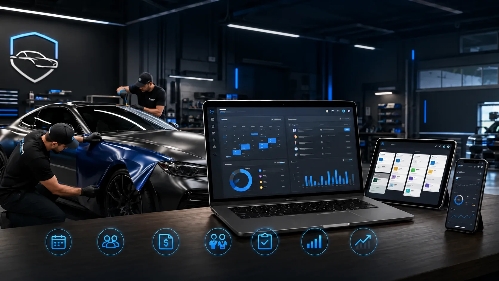
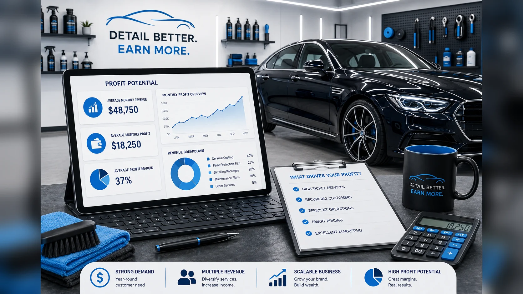
Raw data isn't the goal — seeing it clearly is. This is where a dashboard changes everything. A good dashboard takes all the job and service data you've captured and turns it into a visual picture of your business: revenue trends over time, a breakdown of your service mix, how each part of the shop is performing, all at a glance.
The difference between a shop that has this and one that doesn't usually isn't the data — both shops generate the same information. The difference is how that data is organized and displayed. A spreadsheet showing last month's numbers is analysis you have to dig for. A live dashboard is a control panel you glance at to know exactly where you stand right now, spot a trend before it becomes a problem, and walk into every decision knowing your numbers instead of hoping.
Bringing it together with OXMotive
OXMotive is built to make this effortless. Its job management captures every service as it happens, so your data is accurate and current without extra admin work. And its real-time reporting turns that data into a clear dashboard — revenue, service breakdowns, and shop performance visualized so you can see at a glance what's working and where the gaps are, whether you're reviewing today, this month, or the whole quarter.
Your shop is already producing all the data it needs to grow. Capturing it and seeing it clearly is how you turn a business that merely feels busy into one you know is profitable.
Frequently asked questions
Why should an auto shop track jobs in real time?
Because data captured as the work happens is accurate and complete, while data reconstructed at month-end is error-prone and full of gaps. Real-time tracking gives you a live picture of the shop right now and a trustworthy historical record you can analyze later.
What shop data is worth capturing day to day?
At minimum: what service was performed, which technician did it, how long it took, and what it brought in — all categorized by service type. That breakdown is what lets you see which services are profitable, which are growing, and where the gaps are.
How does tracking service types help my shop make more money?
A single revenue total hides why you made the money. Breaking revenue down by service type reveals which lines are most profitable, which are fading, and which aren't worth the bay time — so you can lean into winners, fix or drop losers, and adjust pricing with confidence.
Why use a dashboard instead of a spreadsheet?
Both hold the same data, but a dashboard turns it into a visual, real-time picture you can read at a glance — revenue trends, service mix, and performance — instead of numbers you have to dig through. A spreadsheet is backward-looking analysis; a dashboard is a live control panel for daily decisions.
What can I learn from reviewing shop data at the end of a quarter?
Quarterly review reveals the trends that daily numbers hide: which services carried the business, which underperformed, whether your average job value is rising, and how the period compares to the last. Those insights drive concrete decisions on services, pricing, and staffing.
Ready to see your shop's performance clearly instead of running on gut feeling? Book a demo of OXMotive and see how real-time job tracking and reporting work together.
Subscribe to our newsletter today
Fresh insights and practical tips delivered every week.